Dark Mode’s impact on Email Marketing
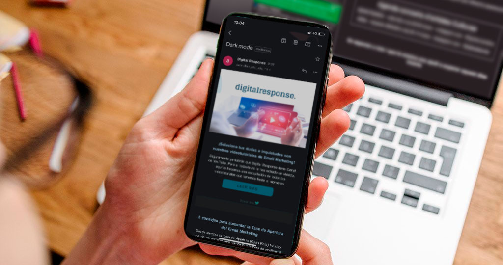

In the last few months, we have seen the arrival of a new way to visualize our digital workspaces: Dark Mode. And it is here to stay. Since Apple started using it last year, many devices and apps have already begun adapting to this new form of content display, creating confusion in the email marketing field when adapting our CSS styles to this new display. Our first question is:
What is Dark Mode for?
- Less eyesight damage. The decrease in the screen brightness requires less effort from our eyes.
- Increases comfort in dark environments. Dark mode helps us use screens during the night or in spaces with low light.
- Battery saving. Dark colors require a lower brightness, which uses less battery.
The popularity of dark mode has rapidly increased, as users appreciate the extra comfort and more extended durability of the battery. And with this accelerated growth, the email field has welcomed it in a disorganized and inconsistent way. Before diving right into it, a side note: we will be talking about HTLM developed emails since text emails invert natively without any problem.
Which email clients allow dark mode?
- Mobile Apps
- Gmail App (iOS / Android)
- Outlook App (iOS / Android)
- Desktop Apps
- Apple Mail
- Outlook 2019 (Mac / Windows)
- Website clients
- Outlook.com
How do the different email/device clients apply dark mode?
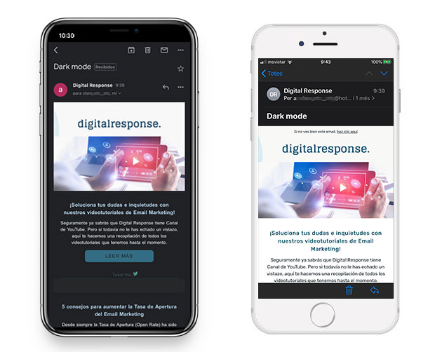
Here is where the madness begins. There are 3 different ways of applying dark mode depending on the email client:Inverting all the colors declared in CSS (Total inversion), only inverting light backgrounds and maintaining the same colors in the already dark areas (Partial inversion) or respecting the original colors (Original color).
The different email clients apply it in the following way:
- Gmail App (Android) Partial inversion
- Gmail App (iOS) Total inversion
- Outlook (Android) Partial inversion
- Outlook (iOS) Partial inversion
- iOS Mail Original Color
- Apple Mail Original Color
- Outlook 2019 (MacOS) Partial inversion
- Outlook 2019 (Windows) Total inversion
Source: Litmus Blog
This diversity in the way of applying dark mode is the first setback that we encounter when trying to find a stable solution for all the clients. Our email is now displayed very differently in different settings, and we need it to be as consistent as possible.
Which email clients allow overwriting their dark mode style?
Not only do the different email clients apply dark mode differently, but the support for the CSS styles used to give it shape is not uniform either.

This is important because given there isn’t an understanding between the different email clients on which details can be overwritten, our efforts in making the email look the same everywhere will be in vain. We can only try to minimize the damage to the designs of the different versions inflicted by the changes.
Apple apps let us code specific styles for dark mode using a media query:
@media (prefers-color-scheme: dark)
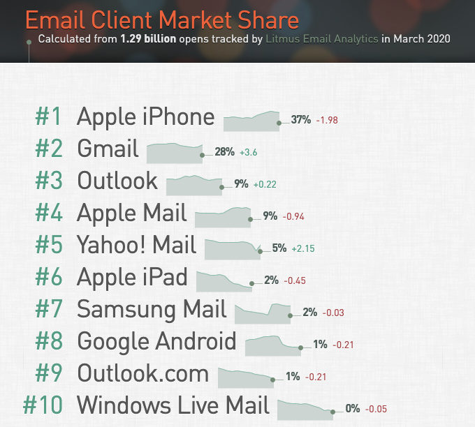
This method, however, cannot be used in the rest of the devices and apps. After Iphone’s native app, the most used email client is Gmail, whose app does not allow changes on their dark mode styles. Another client that doesn’t allow any modification to the styles is Outlook 2019, although this app is quite irrelevant when it comes to B2C lists. Lastly, a service that does allow changes through another method is Outlook.com; Mark Robins explains here how to do it by using the tags [data-ogsc] and [data-ogsb].
Outlook.com, however, is not one of the most-used services either, which complicated the justification of developing styles specifically for it.
Summarizing
Let’s retain the following ideas:
Apple is the system that “breaks” our email the least in dark mode, maintaining by default our HTML styles and applying dark mode solely on the app interface and not the content of our email. We can, however, create specific styles for the dark mode that affect the content, which would involve generating a particular code for this dark mode and would be included within a media query to the original HTML for the normal mode.
The issues arrive, mainly with Gmail App, Outlook.com, and Outlook 2019 Windows. There is no way to shape the dark mode of Gmail and Outlook 2019 through CSS. And in the case of Outlook.com, since it requires a specific code for it and it is a minority service, it ends up at the back of the development priorities line.
After this analysis and bringing it to everyday practice, we reach the following conclusions…
Given the complexity of the different visualizations and supports of all the email clients, the development of ad hoc solutions for dark mode can end up being really pricy and, the result, heterogenic. Any application of specific styles for dark mode would only apply to Apple devices (where the original design is already shown correctly) and Outlook.com (minority). Gmail App is one of the most-used clients, and we cannot apply changes to the dark mode through CSS.
Because of that, the development of specific styles for dark mode may not be profitable (since it would require development time and the subsequent costs, for a result that can’t be applied in a uniform and stable way to all email clients). Even so, if we have enough resources, we could develop solutions aimed at Mac/iOS and Outlook.com apps by using the previously mentioned methods.
But in reality, the scenario we most come across is that clients do not usually see as profitable this kind of development, given the inconsistent results we encounter nowadays. Since iPhone (majority service) shows the original design by default, and we can do nothing to edit the styles for Gmail App (second most-used service), it is common to use simpler solutions without the need for a significant investment in time and resources. These solutions are based on adapting images to the different settings and adjusting the code to stabilize some inconsistencies.
Adapting images for light and dark mode
For a correct visualization of the images in both settings (light mode and dark mode), in the design phase, we must ensure that the delimitation of the different elements looks clean and aesthetic, both in light and dark backgrounds (the designers must visualize the elements on layers of different colors and allow transparent cutouts where needed). Here are some resources:
- Using dark logos on solid backgrounds
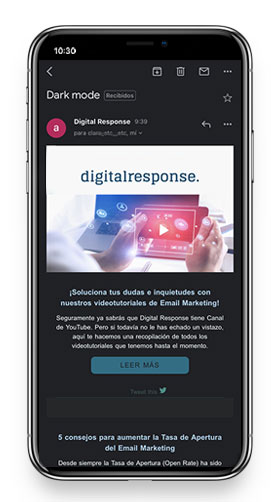
In this case, we can use the logo as an image block, with a light background included and proportionately adapting it to the device’s full width.
- Shading and silhouettes
An alternative to a solid background is to silhouette the logo or text in the image with a light color, either with a shadow or a line.
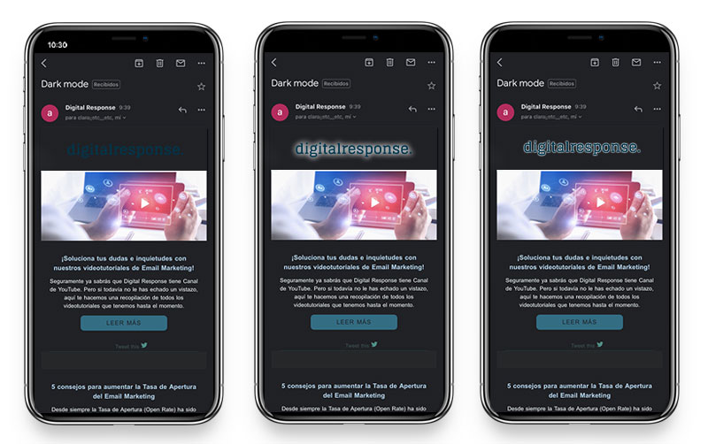
- Shapes
In the case of some icons, as could be the ones for social media, it is very helpful to use shapes (circles, rounded rectangles…) since conventionally, they are frequently used in this way. Using the original email’s background color, the shape would only show when using dark mode. We can also make it visible in both versions by using background colors distant to dark grays and the original email’s light color.

This is the current situation when it comes to applying dark mode to email services. Even so, we are keeping an eye on possible updates since, given it is still a novelty, it will likely be subject to changes.
Now you have all the key points to adapt your email to dark mode. What is your experience with it? Have you already made changes to your emails to optimize their display on all settings?
